
 Алгебра
 Английский
 Биология
 География
 Геометрия
 История
 Русский
 Обществознание
 Физика
 Химия
Химия Информатика
 Литература
 Математика
Вопрос:
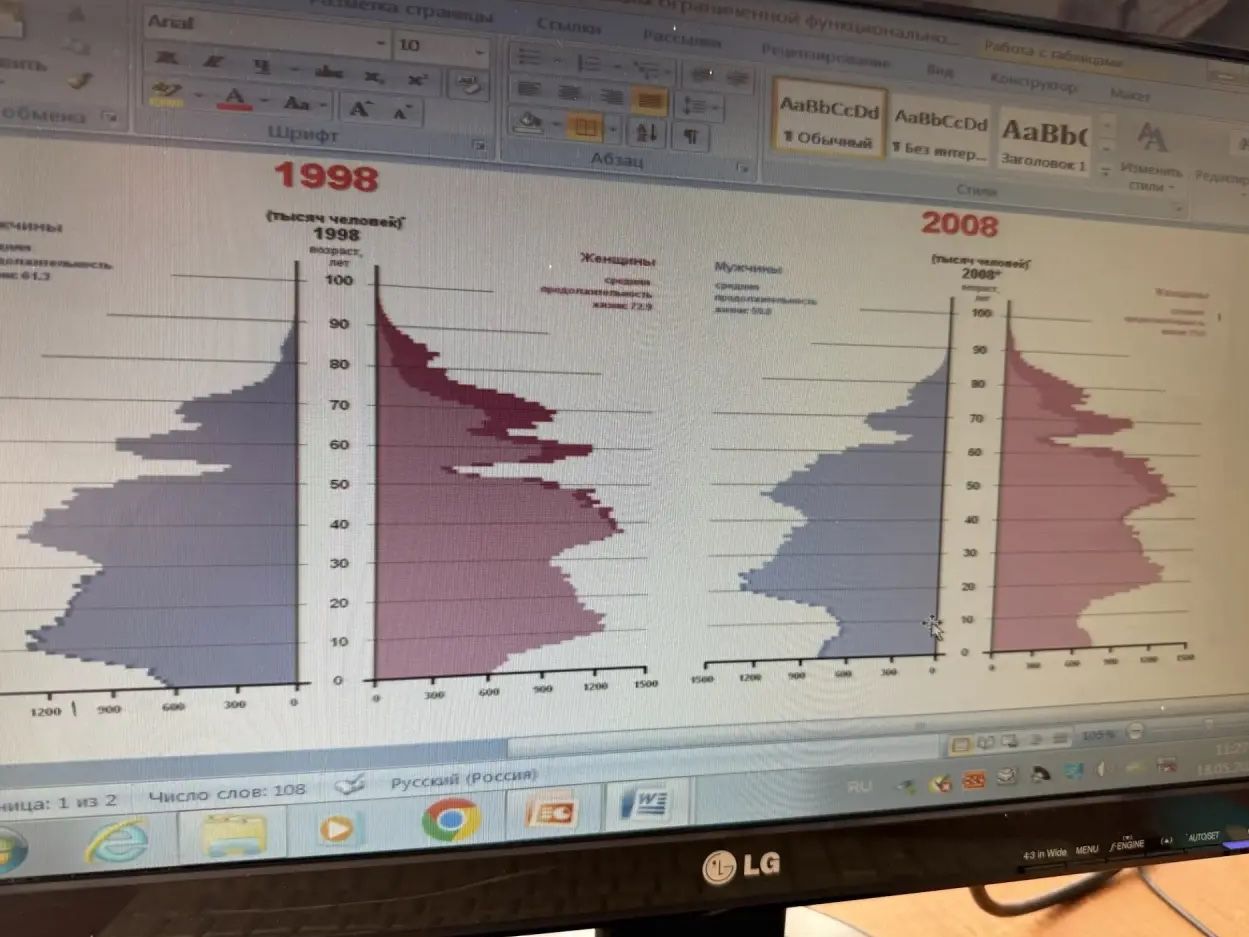
The image displays population pyramids for Russia in 1998 and 2008. Describe the general demographic trends shown in these pyramids.
Ответ:
Demographic Trends in Russia (1998 vs. 2008)
The image shows two population pyramids for Russia, comparing the years 1998 and 2008. Population pyramids graphically represent the distribution of various age groups in a population, typically separated by sex. In these pyramids:
- Shape: Both pyramids show a relatively narrow base, indicating a declining birth rate or a smaller proportion of young people compared to older generations. The widest parts of the pyramids are in the middle age groups (around 30-50 years old).
- Aging Population: The pyramids suggest an aging population, with a significant proportion of individuals in older age brackets. This is indicated by the wider bars in the upper sections of the pyramids, especially when compared to the base.
- Sex Ratio: Generally, there appear to be more females than males in the older age groups, which is a common demographic phenomenon due to differences in life expectancy.
- Changes Between 1998 and 2008: While the overall shape is similar, subtle changes can be inferred. The pyramid for 2008 might show a slightly more pronounced narrowing at the base and a further bulge in the older age groups, potentially reflecting continuing demographic challenges and increased life expectancy for some segments of the population. The dips and bulges in the bars represent the impact of historical events (like wars or baby booms) on specific age cohorts.
In summary, the population pyramids of Russia for 1998 and 2008 illustrate a trend towards an aging population with a declining birth rate and a higher proportion of females in older age groups.
