
 Алгебра
 Английский
 Биология
 География
 Геометрия
 История
 Русский
 Обществознание
 Физика
 Химия
Химия Информатика
 Литература
 Математика
Вопрос:
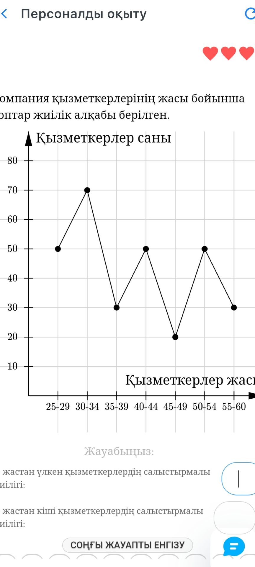
The user wants to analyze the provided image which contains a line graph. The graph shows the number of employees by age group. The user has not asked a specific question about the image.
Ответ:
The image displays a line graph illustrating the distribution of employees by age groups. The x-axis represents age ranges (25-29, 30-34, 35-39, 40-44, 45-49, 50-54, 55-60), and the y-axis represents the number of employees. The data points are connected by lines, showing fluctuations in employee numbers across different age demographics.
